When it comes to interior design colour schemes, pink and blue are not normally colours I’d automatically put together, and certainly not pastel shades. But thanks to global colour authority Pantone announcing in December 2015 that their Colours of the Year for 2016 are Rose Quartz (pink) and Serenity (blue), suddenly these two colours are being pushed to the forefront.
Along with some other home interior bloggers, I’ve been working with Wayfair to see how easily these two shades can be incorporated into the home.
The colours
Pantone’s Rose Quartz is a soft dusty pink, whilst the serenity blue is an interesting shade of cooler blue, with a hint of purple in it.
Pantone say:
Together they remind me most of of sunsets, and the colours in the sky blending together as one as the sun sets on another day.
In fact, two postcards I love sprang to mind immediately – one depicting surfers on a beach at sunset, and the other a favourite image of a piece of appliqued hand-dyed silk, which features a blend of both of these colours. They had to feature somewhere in the room scheme…
Styling a bedroom with Pantone Colours of the Year
I wouldn’t automatically choose to put pink and blue together, not least in a bedroom, but with the combination of feminine (pink) and masculine (blue) it seemed like an interesting pairing.
Online store, Wayfair, have a wide range of homeware products available, so off I went for a (long) trawl through the options. After much deliberation, I chose to use the following products:
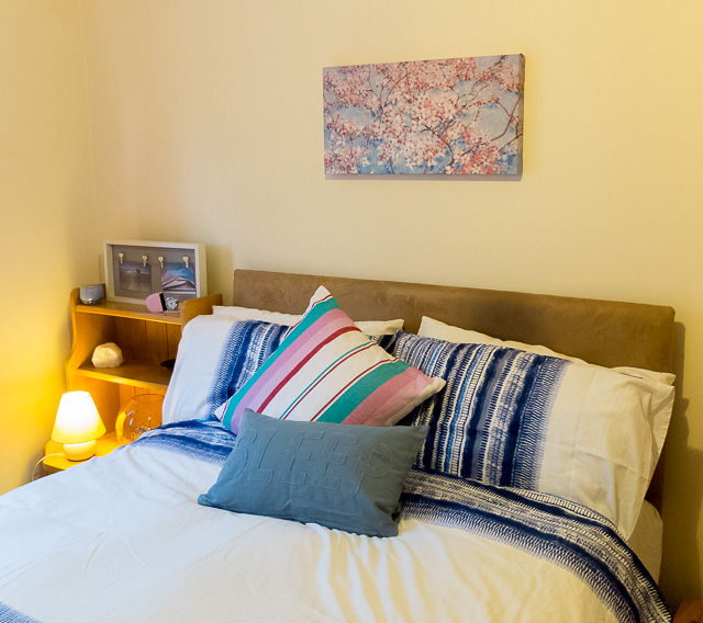
Full blossom art print by Nicola Acaster (£39.99)
Wayne Ridge 220 count cotton duvet cover set (£38.49)
London Clock Company pink faux leather alarm clock (£20.99)
Rocca Streep cushion cover (£17.99)
Sleep cotton cushion cover (£16.99)
I knew I wanted to incorporate my two postcards into the room somehow, but the size of them meant that they wouldn’t really provide enough impact on their own. So I chose a larger canvas print in the form of the full blossom art print, by Nicola Acaster. The canvas print features cascades of pretty pink cherry blossom against a sky full of shades of blue.
For a bedroom scheme, having the right bedding is essential. Pink bedding would have been a bit much for me, so I opted for the Wayne Ridge duvet cover set in blue and white. It’s a nice contemporary design and the stripes of colour, with their blends of shades, means that it’s got just the right amount of balance and is not an overpowering design.
No bed is complete without some extra cushions. I may well have mentioned before that I’m a bit of a sucker for cushions and have quite a collection (ahem), so it was useful to discover that these two were available to buy as just the covers. The stripy square one and rectangular blue one fitted perfectly over existing cushions.
Sometimes it’s hard when buying online to get a good impression of the real colour of items. In the case of the stripy cushion, the blue in it turned out to be way more turquoise than I’d expected – not a good match for the Pantone Serenity blue, but the two shades of pink are ideal to represent the Rose Quartz.
I was tempted by lots of lovely blue glass vases at Wayfair, but then I spotted the London Clock Company’s pink faux leather clock and had to opt for that. It’s a fab bit of retro styling and the pink fits in perfectly in the room.
I also added a few other accessories I already owned, including a blue scented candle and a large chunk of rose quartz. And, of course, here are those two postcards:
All in all, it’s been an interesting experience and has definitely made me rethink my views of combining pink and blue. For a bedroom colour scheme, the blue is refreshing, whilst the pink is restful, so the two work well together.
For more product ideas featuring these two colours, have a look at Wayfair’s Ideaboard.
(Disclosure: The post is in association with Wayfair, but all views and opinions are our own).
0


These colours work so well together, I love that cute little clock.
It’s a fab little travel clock.
Your post cards really do capture the two shades perfectly! I too was unsure about the colour combo at first, but it’s good to experiment and come out of our comfort zone sometimes. Great product choices! x
Thanks, Antonia. I loved your interpretation of it too.
Love the cute postcards Rachel xx
The postcards seem to have been the unexpected stars!
Loving the little postcards, such a perfect way to incorporate both colours into a scheme! xx
Thanks, in this case I wish they’d been super-sized and suitable for the wall!
Great scheme and I love how you incorporated the postcards. Looks lovely and fresh.
Thanks, Karen. I wasn’t too sure about it at first, but it’s grown on me.
All I can say is that I simply adore the Pantone colours this year. That’s a cute pink and blue cushion.
I loved the display you’d put on your blog on the big reveal day, Geraldine.
Love the stripes, great way to bring a bit of colour into the bedroom x
The post cards box frame is a great idea. I am more like a BW this year but I love the color mix of those two.
I just love these two colours! Cute postcards 😉 A x
It works so well in the bedroom, and i love what you did with the postcards!
oh that clock is super cute!